

Aesthetic Design VS Functionality
Most people are familiar with the concept of “Form follows function”, but in the design world, that mantra is always being questioned. Everyone wants to stand out from their competitors while still portraying their message clearly and effectively. Focusing too much on function can lead to a dull design, but paying too much attention to aesthetics can result in poor user experience. Finding a good balance of the two is crucial to achieving a great design.
When Function is a Given
Often times in design the function of a piece is simple. Whether it’s a simple direct mailer or the box for a product, the function of that specific item is pretty hard get wrong. The function of direct mail piece is simply to get the viewer to open it and consume the message. Since most direct mail is just a flat piece of card stock, having a piece that is designed for aesthetics can be much more enticing to view. This will lead to much better consumption of the message of the piece. The aesthetic value can be pushed even more so if the mailer becomes an interactive piece, that is begging to be opened. While there is the risk of it not being opened at all, if the piece has a focused aesthetic it may result in more time spent viewing the content.
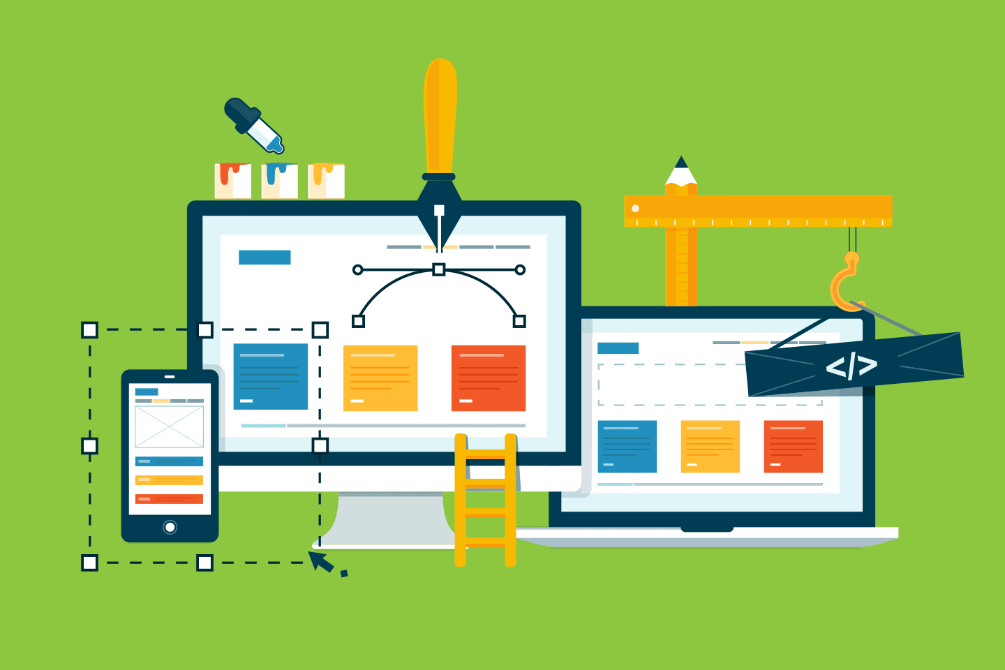
Finding Balance
Designing a website can be a treacherous task. Some clients aim to fill their website with all the latest bells and whistles. This can make for a very interesting and interactive website, but when it comes to the actual function and navigation of the website it may fall short. Often times viewers become distracted by things that are added purely for the aesthetic value, which results in a poor user experience. Website designs should be clear and simple to navigate. However, a website that is too minimal may look beautiful, but leave out information that the viewer is searching for. For instance, an e-commerce site that is filled with enticing photos may look pleasing at first glance, but may lack the information used to compare products to one another. The key is finding the right balance and designing accordingly.
Innovation Can Be Functional and Aesthetically Pleasing
Sometimes new and innovative ideas that are designed purely for form can increase the aesthetic value as well. For instance, the Pringles can has been an iconic part of their brand for decades, and always stands out from the competitors packaging. This alone gives it a strong aesthetic value. The can also supplies greater function than a standard bag in keeping the chips organised and less likely to be damaged. The only downside is the struggle to reach the chips at the bottom of the can.
The balance of function and aesthetic is becoming more and more important. With the rapid evolution of technology, people are becoming more expecting of instant gratification–and that definitely carries over to design. Face value is more crucial than ever, and that is entirely controlled by the aesthetic that the brand portrays. However, having a finely-crafted aesthetic can only grab the attention of the viewer. It is up to the function to provide the information clearly and concisely.
Article source: thirdside.co